Coolors.co


It feels like more than a coincidence that my spirit animal is a chameleon, and my final senior research project turned out to be Coolors—a platform all about color.
Chameleons are known for adapting, and that’s exactly what I had to do during this project. Because to be honest, as a creative in an advertising agency, back when I was younger, I didn’t really like or trust user testing. Admiring groundbreaking creative ideas like Apple’s 1984, Nike’s NFL spot, KFC’s FCK, or Burger King’s Mold Whopper—ideas that would likely get shut down in a testing room—I once thought user testing was for overly cautious clients who were afraid to take risks. But oh boy, how naive and childish I was.
Under Prof. James’ guidance, I learned how to properly conduct research and finally saw the real value of user insights. Now, I realize those who blame user research are often just insecure creatives making excuses for not pushing themselves to do better. The goal of user research isn’t to water down creativity—it’s to ensure that our work resonates with the right people. It’s about creating their thing, not our thing. This portfolio piece is a reflection of that journey.
1. Heuristic Analysis
We started by using Jakob Nielsen’s 10 Usability Heuristics to observe and identify initial usability issues with Coolors. From there, we provided recommendations based on what we found. It’s funny because this step alone used to be my entire research process. As a creative, I’ve always trusted my gut and intuition—I’d glance through something, pick a metric, and judge it right away. This experience was a humbling reminder that my usual approach was just the first step of a much larger, richer process.

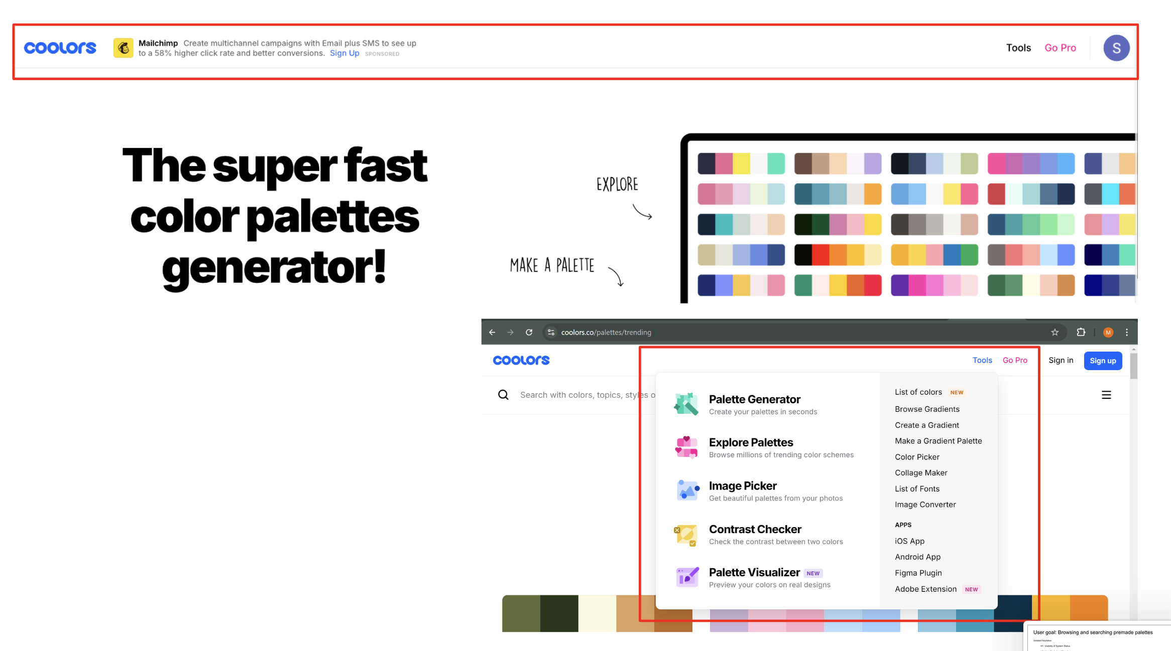


2. Competitive Analysis

Next, we dove into a competitive analysis, comparing Coolors with other tools in its space. I’ve always loved Color Hunt—a website my first creative director showed me when I started as an intern. It was challenging not to let my bias show, but I focused on assessing each tool’s features and user experience objectively. This exercise pushed me to grow as a researcher, reminding me that preferences don’t always equate to usability or value.


3. Usability Script & Thinking Out Loud
Creating the usability script was where I realized just how important clarity and neutrality are in research. The script needed to guide participants without leading them or influencing their responses—a challenge that made me think carefully about how I phrased each question and instruction. To practice demonstrating the "thinking out loud" technique, I role-played as a Creative Director critiquing my own portfolio, which turned out to be a surprisingly insightful exercise. Because funny enough, I ended up making real changes to my About Me page based on my own critics I had while roleplaying.

This was also my first time recording usability sessions and organizing the data into a clear, step-by-step format. With this, we weren’t just relying on memory —we had tangible evidence to support our findings. This structured data became the backbone of our presentation, allowing us to confidently highlight patterns, pinpoint problem areas, and suggest improvements.


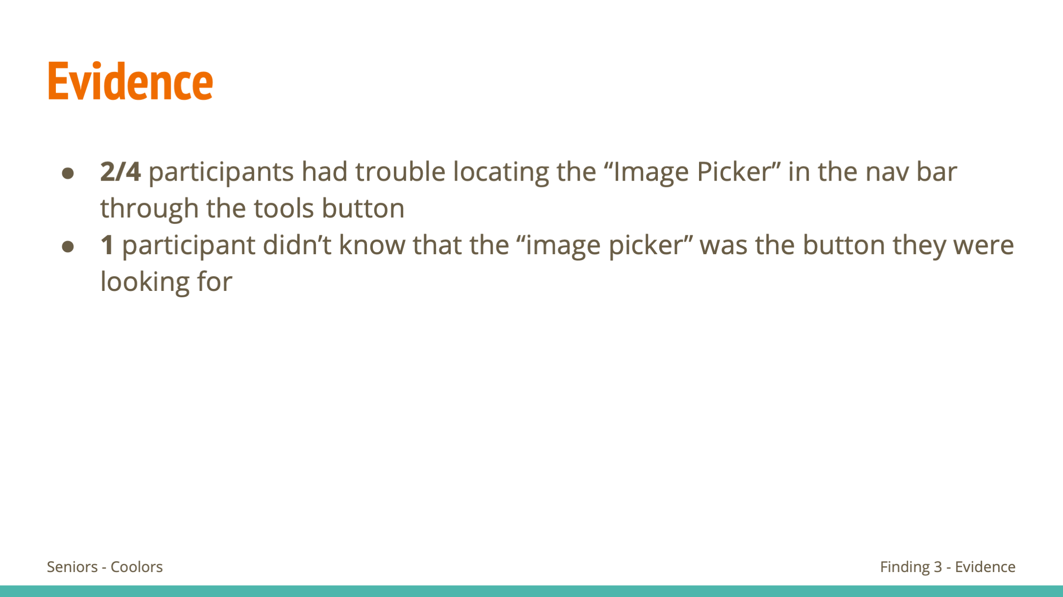


One key part of the process was identifying and including short video clips that showcased moments where users struggled or got stuck. These clips were crucial in supporting our findings, as they provided clear, visual evidence of the issues we observed. It was surprisingly rewarding to find the right moment that perfectly encapsulated a problem—it felt like piecing together a puzzle to tell a compelling story.
4. In-Depth Interviews
Next came the in-depth interviews. Here, balancing sticking to the script while asking the right probing questions was a big learning curve. This is where my chameleon-like flexibility really shined. Staying open and reactive while steering the conversation toward meaningful insights was a challenge, but it allowed me to uncover details I’d have completely missed otherwise. It was about building a natural flow that felt like a conversation rather than a rigid Q&A.


When it came to analyzing the data, it felt like piecing together a post-it note puzzle. Revisiting the interview recordings and responses, patterns and themes began to emerge like connecting dots in a larger picture. It was incredibly satisfying to uncover what mattered most to the users—what motivated them, where they struggled, and what they wished for. These insights became the foundation for the next stages of research, ensuring every step forward was rooted in user-driven evidence.
5. Personas & Empathy Map
Creating our persona, Casey Brooks, was like writing a character for a story. By the end, I felt like Casey was my best friend—I knew how she thought, what motivated her, and even how she’d react in certain situations. We’d even have team debates about whether something “felt like Casey.” As a copywriter, this was a great exercise in developing rich, authentic character profiles.


6. Customer Journey Mapping
Mapping Casey’s journey brought all the research together. It felt like stepping into her shoes and walking through her experience step by step. This process not only clarified her needs but also helped me see how Coolors could better serve users like her.

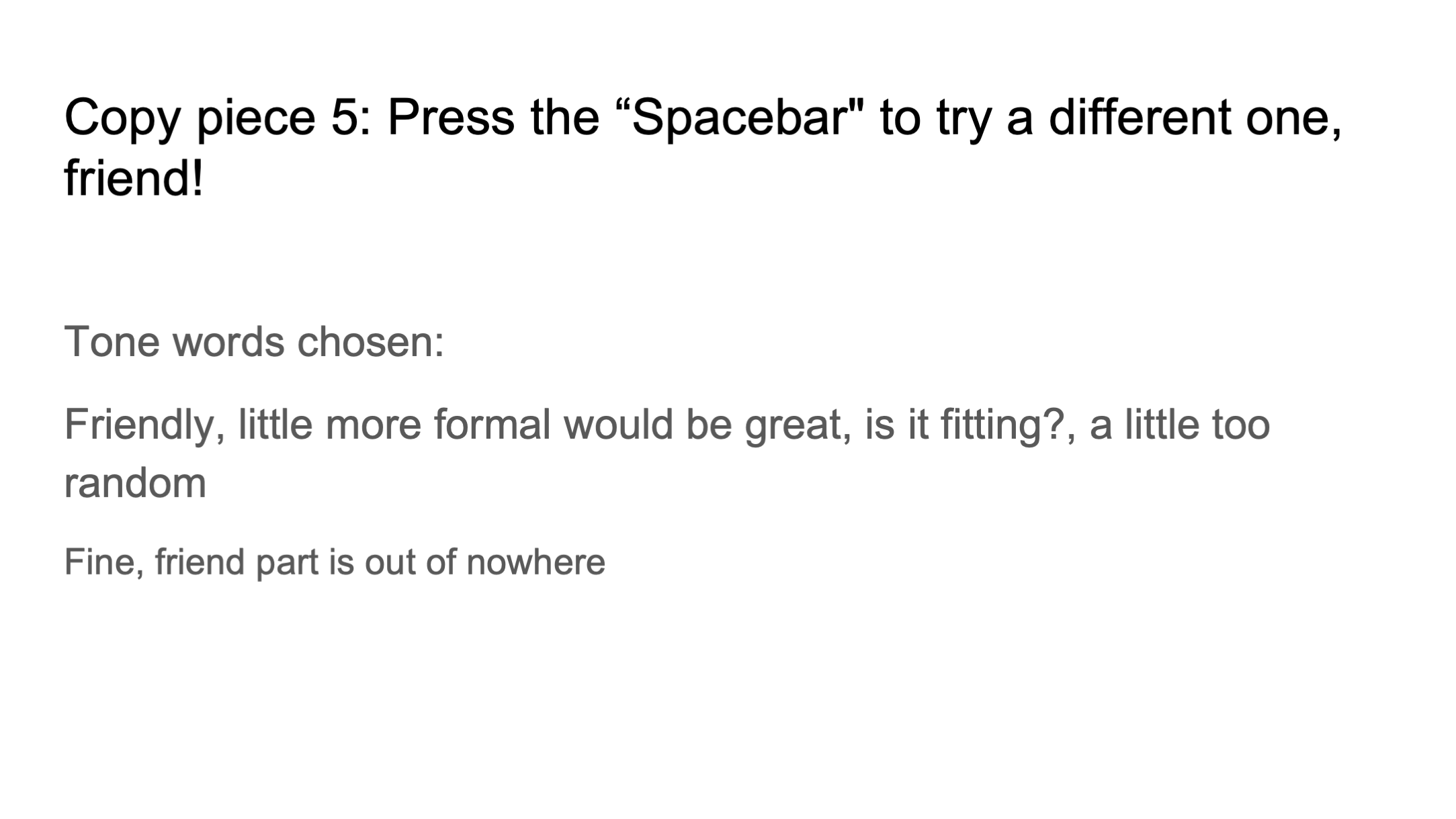
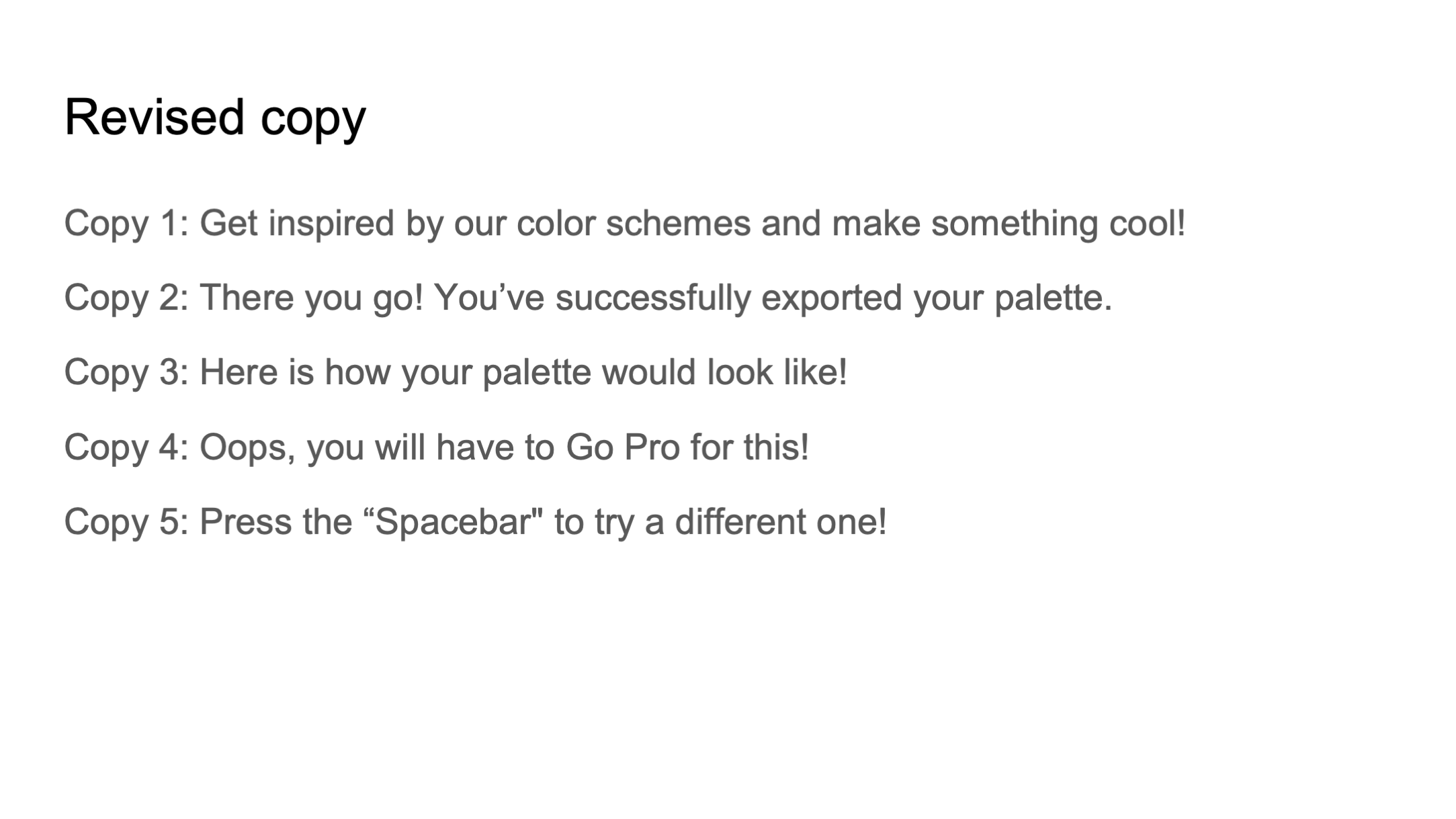
7. Tone Analysis
Tone analysis was a fitting conclusion to our project, tying everything back to my role as a copywriter. Testing my copy for Coolors with participants was nerve-wracking but rewarding—seeing it resonate with users and only needing minor tweaks was validating. By this point, I felt like I knew Coolors so well that I could confidently speak for the brand, ensuring it truly connected with its audience.